Your Cart is Empty
Orders are processed within 1-2 business days, Mon-Fri., for regular and expedited orders.
Orders are processed within 1-2 business days, Mon-Fri., for regular and expedited orders.
How Color Effects Mood
Did you ever walk into a room and feel instantly calm? Often times it’s more than Yanni on repeat that generates that sense of calm. Much of that feeling is attributed to the paint color they chose, and more specifically the undertone of the paint color they chose.
When discussing paint color, we usually think of how the shade will look in a particular room. Did you know that color can also affect the way we feel? The philosophy of color explains how color is directly tied to our emotions. Everyone understands what it means to be “red with anger”, “green with envy”, or what it is to “feel the blues”. When it comes to color for your home, you can control how your home ‘feels’ by the artful – and strategic – use of color.

Color is connected to the light spectrum, and therefore affects our bodies physically, even when our eyes are closed. For example, you could walk into a freshly painted white room and feel how cold it is, but enter a different white room and it might feel fresh and lively instead. Much of this is accomplished by the undertones and formulation of the color itself. That’s why full-spectrum paints are so compelling.
Full-spectrum paints, like every color in the C2 Paint palette, are formulated using multiple pigments that represent more of the color wheel than traditional paint formulas. Additionally, no C2 Paint color uses any black pigment in their color recipes, so you never have a color that looks lifeless or dull. The beauty of full-spectrum colors is that regardless of the current light condition, the paint color interacts with light in a compelling, luminous way.
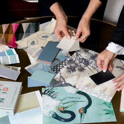
Beautiful full spectrum colorants
Combining full-spectrum paints and armed with a little knowledge about specific colors and how they make you feel, you can create an environment that really makes you feel good. Really good.
Here is a brief explanation of each color and how it affects you:
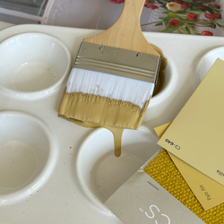
Yellow – It’s virtually impossible to be cranky in a yellow room. Using yellow, anything from palest creams to deepest golds, is like capturing the sun in a jar. Yellow is an energetic color, so use it where you want to bump up the joy.

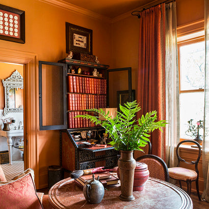
Orange –If you’re looking to stimulate the appetite and add spice, orange is the perfect choice. It also symbolizes change when it’s bright and lively, and represents stability when muted and quiet. In design, energetic orange is a great color to excitement to a neutral space.

Red – Ready to romp? Yup, forget those 50 Shades and use red instead. Red raises your heart rate and time passes in a blur. Take it a little more orange and it’s the perfect color to increase your appetite.

Purple – Interestingly, purple is a combination of hot to-trot-red and cooler-than-cool blue, so it brings both elements to the table. Purple can make your feel very meditative and intellectual or vivacious and royal.

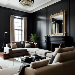
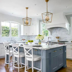
Blue– One of the most popular and reassuring color used in design, blue communicates stability and safety, as evidenced on this chic office wall.

Espionage, C2-742; Whistler White, C2-756 (ceiling, walls, trim)
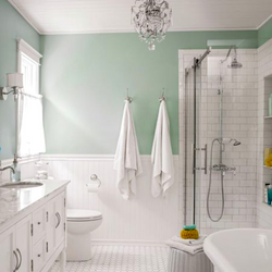
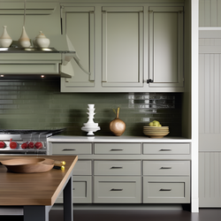
Green – If you want to create a soothing sense of calm, green is your hue. Soft colors, like green sea glass all the way to rich, deep emeralds and olives; green is a great choice.

Also in Color Confidential
Subscribe
Sign up to get the latest on sales, new releases and more …
Recent Articles
- What Paint Should I Use? Your Guide to the Right Product for Each Room

- How Builders Using C2 Paint to Position Themselves as Industry Leaders

- These Paint Color Palettes Can Transform Your Smaller Bathroom into a Luxurious Respite

- 5 Ways to Harness the Power of Color in Your Interior and Exterior Paint Projects

- The Ten Commandments of Choosing Color

- Refresh Your Home This Spring: Top Painting Projects (Plus Recommended Products!)

- The Ultimate Guide to Choosing the Perfect Deck Stain for Your Home

- Painting Kitchen Cabinets: Your DIY Guide to a Perfect Finish

- Boosting Your Home's Value: 6 Home Improvement Projects for Maximum ROI

- Supercharge Your Aspirations by Choosing the Right Paint Color

Categories
- 2020 Color of the Year
- architecture
- art basel
- bathroom paint colors
- bedroom colors
- best bedroom color
- best blue paint 2019
- best green paint
- best grey paint colors
- best grey wall colors
- best neutrals
- best paint colors
- best paint colors for 2020
- best white paint color
- black and white
- black paint
- blue mood board
- blue paint
- blue paint color
- blue paint colors
- C2 paint
- c2 partners
- c2paint
- calming bedroom colors
- calming paint colors
- ceiling paint
- ceiling paint color
- christmas list
- classic paint colors
- color combinations
- color of the month
- Color of the Year
- color of the year 2023
- color palette
- color theory
- color tips
- color trends
- design miami 2018
- design tips
- design trends 2021
- design trends 2024
- eco-friendly
- exterior paint colors
- feng shui paint colors
- full spectrum
- full spectrum color
- full spectrum paint
- gift guide
- gift guide 2021
- gray paint colors
- grey color trends 2010
- grey paint
- grey paint colors
- grey walls
- holiday gift guide
- holiday picks
- home improvement
- home office
- home painting
- home projects
- house paint
- house paint colors
- how to paint floors
- insider tips
- interior colors
- interior desi
- interior design
- interior design best paint colors
- interior design tips
- interior design trends
- interior designer
- interior paint
- interior paint colors
- luxury paint
- maximalism
- mediation room
- meditation
- meditation area
- mexico city
- millwork
- minimalism
- modern decor
- modernism weekly
- moodboard
- neon color trend
- nicole newkirk
- office paint colors
- orange
- paint
- paint color
- paint colors
- paint contractors
- painted furniture
- Philippa Radon
- stockholm design week
- surface design show
- sustainable interior design
- tiny homes
- travel
- trend report
- trends 2024
- vision board
- wall color
- wall paint
- white interior paint
- white paint
- zoe feldman
Subscribe
Sign up to get the latest on sales, new releases and more …
×
There’s a C2 Paint Dealer near you!
Visit the store to get exceptional, in-person service. Click below to see store details
See My Store