Your Cart is Empty
All orders are processed within 1-2 business days, Mon-Fri., for regular and expedited orders.
All orders are processed within 1-2 business days, Mon-Fri., for regular and expedited orders.


When Less is Not Enough: Maximalist Design in 2020 (plus 5 Ways to Keep it Modern)
For years, there has been a laser focus on minimalism, the “less is more” approach to design. Now, many are taking an opposing approach toward MAXIMALISM – which means there is more of everything: color, patterns, and general abundance. The result? A room that’s fully reflective of YOU. Check out these 5 ways to keep this "more is more" approach fresh and modern.

C2 Paint 2020 Color of the Year
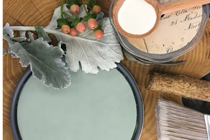
Our color of the year for 2020 is Salty Brine, C2-701. This rich hue floats effortlessly between green and blue, giving it a richness and depth that can only be found in nature. Like water, it is fluid and diverse, carrying organic notes that honor the natural world. This soothing color provides an inspiring backdrop to our search for global solutions that protect the environment, as the focus towards sustainability becomes more of a daily intention. Salty Brine’s complex undertones emit a harmonic frequency to aid in our journey for deeper meaning and purpose beyond material possessions.

C2 Color of the Month: Blue
What lies between violet and green on the spectrum of visible light? The most popular color on the spectrum: Blue. One of the three primary colour pigments in painting and traditional colour theory as well as in the RGB colour model, it consistently ranks as the most popular colour in America
Read More Recent Articles
- How to Choose the Right Paint Finish for Your Project

- Home Projects to Finish Before the Chill Sets In

- Nooks and Niches: Crafting Your Cozy Sanctuary

- Refreshing Your Home for Fall: Embrace the New Season with Style and Comfort

- Infusing Comfort into Your Home Through Color and Creativity

- Color of the Year 2025: C2 Raku

- A Designer Paint for Any Budget

- Know the WHY Behind What You Buy: How Shopping Local Creates Value For Yourself and Your Community

- From Earthy to Ethereal: Choosing the Perfect Bedroom Colors

- Culture Club: Living Adventurously through Color and Creativity

Subscribe
Sign up to get the latest on sales, new releases and more …
×
There’s a C2 Paint Dealer near you!
Visit the store to get exceptional, in-person service. Click below to see store details
See My Store


