Your Cart is Empty
How to use Color of the Year 2023: Design Tips & Tricks
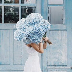
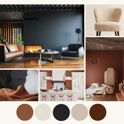
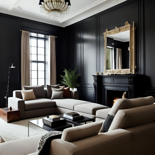
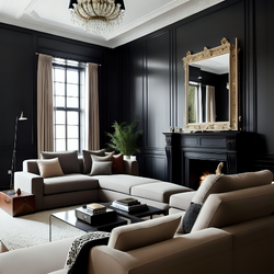
Our color of the year showcases a contemplative collection of earthy hues which we presented as a capsule of interchangeable, related colors that truly define our perspective. Our feature color, Tiramisu is an embracing color that’s rich and restorative, implying a grounding sense of belonging to self and home, while the sultry richness of Stout brings an intensified, intoxicating, velvety feel which is in contrast to En Pointe's luminous and nuanced off-white. Each of these can be used to accent and support each other or can stand alone in its strength of color.

The idea behind this "capsule collection" was to provide three foundational colors that give the opportunity and security of a thoughtful, useable palette that provides a main color, a deep tone or accent, and a light color making it easier for customers to envision and use them in their space.

"It's crucial that our colors are approachable and natural, so while we've seen a lot of bright, whimsical colors that reflect the digital world surrounding us, we felt the need to speak to home as a place where we restore and renew mind, body and soul. It's a sacred place where we can be our authentic selves in a world full of filters and likes, curated feeds, and metaverses." -Philippa Radon, C2 Paint Color Specialist & Designer

C2 Paint colors are ever classic; you won't find any jarring or unnatural colors in our palette because we want them to all be useable and versatile—and due to their full spectrum nature, they integrate with each other and with other design elements of your space.
The Inspiration
As color and trend experts, we combine research across a variety of industries and consider the political landscape and lifestyle trends around the globe to determine a general direction of color. We then collect multiple colors to see what resonates with us personally and professionally, asking ourselves questions like: How does this color make us feel? Is it usable and versatile? Does it breathe new life into the home?

The more we experimented with Tiramisu, the more we felt connected to its rich, restorative color and reference to earthy elements like clay and soil, which are naturally complemented by the full spectrum of the natural world surrounding them. Tiramisu's versatile cedar tone reflects our need for connection and grounding, especially when we were all physically disconnected. Also, to keep us grounded in a digital world, we wanted a color that reinforces a sense of self and provides a lifeline to the world outside.
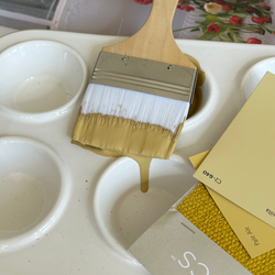
How to use the colors:

SHOP THE COLLECTION
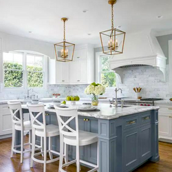
We intentionally provided a trio capsule to make color planning easy. All the colors (Tiramisu, Stout, and En Pointe ) are interconnected and interchangeable. Based on your comfort level with color, you can mix them in any fashion by choosing a dominant color and one or two accent colors. For the color shy, perhaps choose En Pointe for your primary color to stay within your comfort zone (a very fluid and modern take on off-white) and use Stout on the millwork (which is an easy way to add a sophisticated touch).

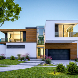
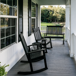
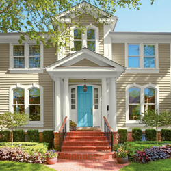
If you aren't comfortable painting with a third color, you could introduce Tiramisu-inspired accents, like furniture, rugs and pillows. We love the idea of using all three colors in a cool, color-blocking way. Tiramisu can also be used as a dynamic exterior color to achieve a Mediterranean feel in warmer climates.
Complementary Colors

It works beautifully with the other capsule colors – Stout and En Pointe. But you could confidently introduce a blue like Harmonic (C2-976) or a soft green like Peppermint (C2-714). One of my current favorite accents for Tiramisu is Rice Paper (C2-900), a soft, pale pink.
Materials & Textures

We like to pair it with materials of similar strength and warmth to create some balance. We love it with a range of natural wood tones, especially cerused wood. Accents like lambs wool or any kind of exaggerated boucle and a sparkle of a metallic add a level of modernity. As for hardware, the more handcrafted and unique, the better. A matte black perhaps or a custom hammered or knurled bronze with texture and an uneven line and surface.
See the Video
View the Look Book
Also in Color Confidential


Recent Articles
- What Paint Should I Use? Your Guide to the Right Product for Each Room
- How Builders Using C2 Paint to Position Themselves as Industry Leaders
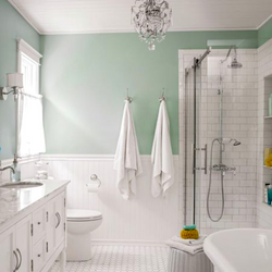
- These Paint Color Palettes Can Transform Your Smaller Bathroom into a Luxurious Respite
- 5 Ways to Harness the Power of Color in Your Interior and Exterior Paint Projects
- The Ten Commandments of Choosing Color
- Refresh Your Home This Spring: Top Painting Projects (Plus Recommended Products!)
- The Ultimate Guide to Choosing the Perfect Deck Stain for Your Home
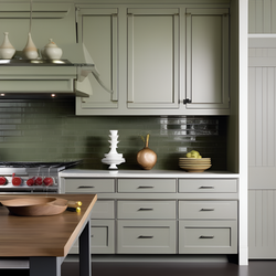
- Painting Kitchen Cabinets: Your DIY Guide to a Perfect Finish
- Boosting Your Home's Value: 6 Home Improvement Projects for Maximum ROI
- Supercharge Your Aspirations by Choosing the Right Paint Color