Your Cart is Empty
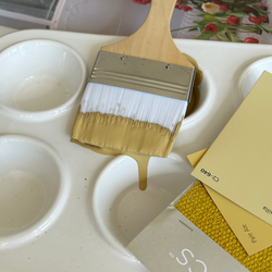
Reimagined Neutrals: Timeless Colors With a Modern Sensibility

When you think of neutral paint color, our mind often beelines to grays and beiges--and while they are both incredibly versatile colors, with a wide variety of nuances, there is also a striking band of neutrals that feature natural tones with an underlying edge, making each of them feel alive and unique.
Presenting an entire palette for the home offers and ability to create a mosaic of “moments” within the same architecture. This Collection presents a refined and versatile arrangement — from crisp and cool to warm and enveloping, each color supports the need for comfort and individualism, while honoring the sanctity of home.
"This Reimagined Neutrals palette provide a timeless palette that can transition from room to room with flow and continuity, while still giving each space its own personality. they are beautiful individually but pair perfectly as a fluid collection."____________________________
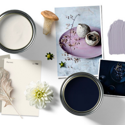
BELLA DONNA (C2-782)


This “beautiful lady” proves that lavender tones are an unquestionable design force. Lingering between grey and violet, this sophisticated color has made its way into the neutral category, given its timeless and transitional appeal. Its morphing subtleties and serene nature make Bella Donna a perfect choice for bedrooms, yet its popularity as a color for shared spaces is on the rise due to its free-spirited yet cultured, bohemian vibe.
WHERE- Try in a shared space as a unique neutral, anchoring it with metals and natural-toned light textures. A perfect choice for the bedroom.
WITH- Creams, grays, and dusty soft off green neutrals — or with darker tones of the same color to build a monochromatic, layered story.
____________________________
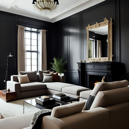
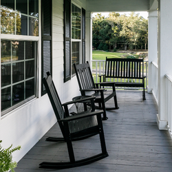
BRIGAND (C2-757)


This bold and mysterious blue-black introduces a confident new wave in the modern neutral Collection by reversing the traditional role of darker furnishings and accents against a light color. Brigandis not all it appears. With the introduction of light, it radiates shades of blue, showcasing a color that’s moody and dramatic. In its darker moments, it remains illuminated through multiple layers of pigments and colorants, which create a user-friendly, intense depth of color. A true rebel, it’s made with no black ink, so it’s approachable and not over-saturated.
WHERE- Reception areas, powder rooms, living rooms, hallways, and other areas that open into a lighter palette for a high contrast experience. Use as a dramatic exterior color for wood, trim, or brickwork. The deep color is also perfect for a bookcase accent color and looks stunning with jeweled or hammered hardware.
WITH- Brighten with crisp white, near-blacks, or go monochromatic with varying shades of blue.
This unique take on neutrals acknowledges the need for safety and security while being bold and diverse enough to express the different aspects of ourselves.
____________________________
PAPER CLIP (C2-928)


A true chameleon, Paper Clipis one of the most adaptable colors in the C2 palette. Not grey, not taupe, it shines as a true traditional neutral. The addition of red and yellow undertones gives it an embracing element that adds a warm, robust energy to the room. Though it’s lighter in color, it’s deep enough to contrast beautifully off white or dark trim. This color can truly hold a space together!
WHERE - An attractive choice for an entry hallway with a black and white checkerboard floor and a dark ceiling. It’s a neutral that picks up the vibration of all other colors around it.
WITH - Pair with tarnished metals or white golds, classic Calcutta marbles, or rich deeper wood tones as a salute to this color’s historical English roots.
____________________________
WATER CHESTNUT (C2-818)


This renaissance color delivers some powerful punches considering its quiet, ethereal, earthy tone. With the ability to bathe any space in its dusty, muted warmth and sophisticated beauty, it performs with an uncomplicated sense of ease and confidence. Water Chestnut thrives as easily in a traditional space—delivering a soothing, classic feel—as is does in a more open industrial environment set against stronger, more rigid lines and dark metals.
WHERE- Bedrooms, baby rooms, glamorous bathrooms or spa-inspired areas.
WITH - Other light colors like soft grays and creams or with darker colors for more dramatic contrast.
____________________________
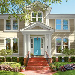
MAINSAIL (C2-996)


There’s no better way to start a new year than with a clean slate. It’s a time to consider what we can offer back from the harvest of our investments — in the home, in our environment, and in our relationships. It’s no secret that choosing the right white can be complicated, but a full spectrum white does most of the work for you. Fresh and classic, Mainsailis a soft-sided white that works with the best design element of all — natural light.
WHERE - Anywhere from exteriors to open spaces. On the exterior, pair with blacks and grays. Inside, it allows artwork and other features to stand out against its luminous backdrop.
WITH - A dark leafy green brings the outside in and offers a high-contrast palette. Use with off-whites for an elevated tranquil vibe, or pair with a soft neutral for an ethereal feel.
Also in Color Confidential


Recent Articles
- What Paint Should I Use? Your Guide to the Right Product for Each Room
- How Builders Using C2 Paint to Position Themselves as Industry Leaders
- These Paint Color Palettes Can Transform Your Smaller Bathroom into a Luxurious Respite
- 5 Ways to Harness the Power of Color in Your Interior and Exterior Paint Projects
- The Ten Commandments of Choosing Color
- Refresh Your Home This Spring: Top Painting Projects (Plus Recommended Products!)
- The Ultimate Guide to Choosing the Perfect Deck Stain for Your Home
- Painting Kitchen Cabinets: Your DIY Guide to a Perfect Finish
- Boosting Your Home's Value: 6 Home Improvement Projects for Maximum ROI
- Supercharge Your Aspirations by Choosing the Right Paint Color