Your Cart is Empty
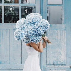
The Bravery of Colour
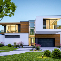
Embarking on a new design project early in the year personally gives me great joy. The feel of a new project ignites my creativity. Winter is a time to gather in, collect ideas, resource, research and immerse oneself into something artistic and creative. What follows the intention of change is a wonderful journey of self discovery, creation and self expression.

Yet, for most of us, despite the plethora of advertisements, TV shows and glossy magazine spreads highlighting well staged and colourful visuals – the annual broadcasting of new colour trends and palettes, still leads many into a panic. Though we should not necessarily feel compelled to repaint and design as frequently as we change our seasonal wardrobe, home is the environment for our self expression. A building portfolio of personal investment that allows us the freedom to surround ourselves in this very high tech world, with tactile comfort and beauty.
“A little color bravery invigorates a space”
The presented trend focus for 2017 appears to highlight three lifestyle curated groupings, and is intended to streamline the overwhelming choices: Composed, Confident and Comfortable. Or perhaps, if this forecast does not resonate with us entirely it might only expand our tendency to feed any lack of confidence we have on our own decision-making abilities.
Introducing something new, bold and beautiful with a diverse colour scheme does take an immense leap of faith and a boatload of courage, if on one’s own. As a consultant, my role is to broaden your perspective and enable you to see the familiar in a new way. To guide you, so you have a greater sense of what you are looking for in order to know when you have found it.
I have created a few professional prompts to help navigate and inspire you into achieving successful and rewarding results.
7 STEPS to Colour Confidence:
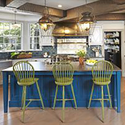
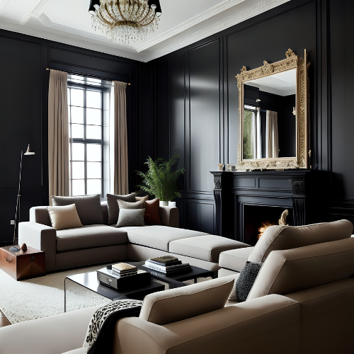
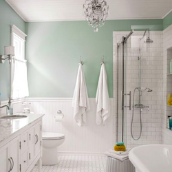
1. Colour equates atmosphere. It’s the most important thing in the room, infusing our surroundings with emotion and vitality. Rethinking our colour choices and breaking habits of familiar ‘go to’ colours is empowering. Most people are afraid of colour until they see the beauty of it on their walls, you just have to take the steps to achieve that. Don’t we all strive to surround ourselves with colours and objects that resonate with our soul – nurture and support our well being in the most positive manner. Colours in particular often evoke reactions that are more psychological than practical, and that is part of the magic that allows you to create an atmosphere that will enable you to feel intrinsically at home.
2. Visualize and Feel the Space. Visualization brings your ideas to life, and allows you to start at the end and work outwards to simply frame and envision the goals you are striving for. So, grab a notebook and cup of tea, sit in the space, clear out clutter, scrutinize and determine the details and character of the room. Visualize and see all the new possibilities for something different; don’t settle for less than your vision.

My design philosophy: Make it Your Own.
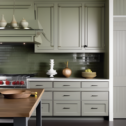
3. Determine the purpose and function of the room before even attempting to view color is key. The functionality will often determine the mood one wants to create. We are striving to create a space that looks right and feels right.
4. Trust your own intuitive voice. Jot down everything that comes to mind. Brainstorm your ideas as a map, not a list, with no order of hierarchy. This more holistic and intuitive approach contributes to creating a space that will inspire and benefit you when you call it home.
5. Get Inspired! Now you have your own personal established foundation about the room details to work from start to resource and research. This means getting out and exploring, not just looking online. Color stems from two arena’s: art and nature — so spend time looking at nature, museums, books, movie sets, fashion, make up counters, magazines, product labels. Try and observe color and co-ordinating colors, in a new way. This should be fun!
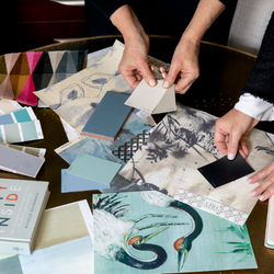
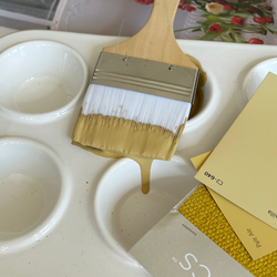
6. Create a storyboard. Remember, we all imitate before we innovate! Paste your ideas and findings into a book — collate and gather all you can. Make the most of all the new data that’s out there and select what resonates most with you. Discern and select your main colour group first, then narrow it down to the right shade. Then think about your partnering colours and the relationships.
My storyboards combine inspiration from nature, textiles and more…
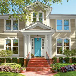
7. Paint Away Problems. Downplay built-ins by painting them the same colour as the walls. Refresh a worn wood floor with an invigorating coat of paint. Enlarge a small space by limiting the palette to shades of just one colour. Don’t be afraid of going dark — a deep hue can transform a room into a magical space. Brighten a dark colour with a sheen finish. Treat ceilings as unexpected terrain with anything but white.
Colour has many more attributes than merely creating an appealing palette. It holds many mysterious qualities, and provides the emotional expression of the space it inhabits. Embarking on a new project, we often take on more work than anticipated, but perhaps with these beginning guide lines and a new approach and self awareness, it will help you to create a home that has balance, harmony and style. So that you can love the colours you live with and make it your own, with a little colour bravery.
About Philippa:

C2 Colour Consultant & Designer
Philippa Radon cultivated her signature colour-based design philosophy through many years of developing her professionally trained eye in the industry. Working with high profile British and U.S. designers, her work as a colour consultant led her to establishing her own full service design firm servicing national and international clientele alike.
Her love of luxurious colour and livable interiors began at a young age. Coming from a curious mix of British aristocrats and artists, and surrounded by painters, writers and politicians, her creative energy and visual hunger was stirred early on. Her extensive travels and time spent living throughout Europe honed her interest in arts and architecture, which naturally progressed into a love of design.
During the span of her colour consulting, fine arts and interior design career, Philippa has established paint lines for Pottery Barn, developed her own organic paint line, and worked on projects for the Victoria and Albert Museum, British National Trust and St. James Palace. Her commercial clients have included Guess Clothing, Ralph Lauren clothing stores, the Pacific Design Center in Los Angeles, Steven Ehrlich, St. John’s Hospital in Los Angeles, William Morris Agency and Maxxam Enterprises. Her residential clients are a diverse group including Warner Brothers VIP John Richards, Benenson Capital in New York, and the artist formerly known as Prince.
Learn more about her at philipparadondesign.com
Also in Color Confidential


Recent Articles
- What Paint Should I Use? Your Guide to the Right Product for Each Room
- How Builders Using C2 Paint to Position Themselves as Industry Leaders
- These Paint Color Palettes Can Transform Your Smaller Bathroom into a Luxurious Respite
- 5 Ways to Harness the Power of Color in Your Interior and Exterior Paint Projects
- The Ten Commandments of Choosing Color
- Refresh Your Home This Spring: Top Painting Projects (Plus Recommended Products!)
- The Ultimate Guide to Choosing the Perfect Deck Stain for Your Home
- Painting Kitchen Cabinets: Your DIY Guide to a Perfect Finish
- Boosting Your Home's Value: 6 Home Improvement Projects for Maximum ROI
- Supercharge Your Aspirations by Choosing the Right Paint Color