Your Cart is Empty
Not to be Forgotten, Mid-range Blues Present a Sophisticated Option

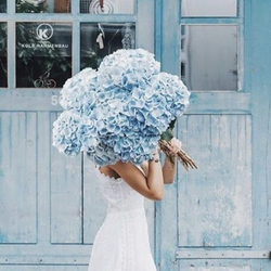
What lies between violet and green on the spectrum of visible light? The most popular color in the range. One of the three primary color pigments in painting and traditional color theory, blue consistently ranks as the most popular hue around the globe.
The Sweet Sounds of Treble

Treble (C2-746) and other mid-tone blues are having their moment. Not light, not dark, it sits in a middle range that presents blue as an attractive, sophisticated color with a traditional, European flair.
Neither light and airy, nor dark and moody, these middle tones are soothing to the eyes.

Mid-tone blues like Treble, Eiger (C2-747), Stockholm (C2-750), Ravine (C2-731), or Apprentice (C2-754) offer a soothing sense of intimacy by enveloping your room in a color that doesn’t seem overcommitted or stifling. Versatile and timeless, these blues can be singularly striking as a solo palette partnered with patterns and prints or used as a chic accent in unexpected places.
Color Placement

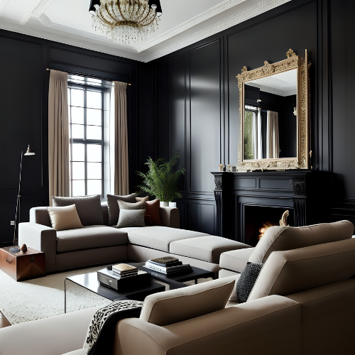
Midtone blues are especially elegant as a bedroom color and contrast nicely with white and natural accents.

Image via @elledecor
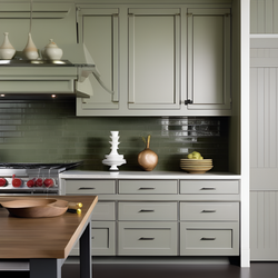
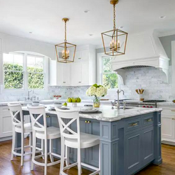
Serene yet vibrant, mid tone blues add a sophisticated color focus on cabinets and walls.

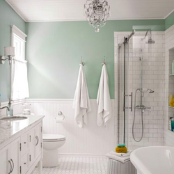
Greg DeMeza uses Bluetonium, C2-753 to create a fun kids bathroom.
Mid tone blues mix well with lighter shades and add enough vibrance to showcase your creativity. The bathroom can also take on a spa-like feel when the color sits on the softer side of blue.

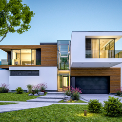
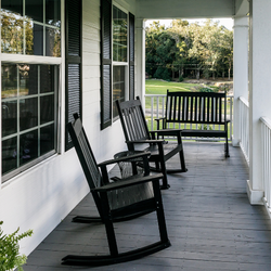
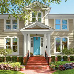
There was an old design saying, "blue and green should never been seen" but that is far from the truth today. For the exterior, these traditional blues maintain a strong connection to the "wide blue yonder" as it integrates seamlessly with the outdoors where land meets sky.
Color Pairings

A popular traditional color combination, a yellow like Banana #672 adds vibrancy.
A neutral like Missing Link #894 is relaxing and grounding.
A pleasing blue-tinted white like Nuance #724 adds a boost to the ceiling or acts as a cool, crisp trim color.
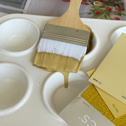
Bringing Midtone Blues to Life

Image via HGTV
- Wood - adding a natural element to these more traditional blues is the perfect combination.
- Foliage - brings life to any color palette with texture and fragrance. Try finding a vintage planter to add some colorful shape and character.

- Wallpapers are becoming a powerful design force and being used in more creative ways than simply on the wall -- and midtone blues pair perfectly with them.
Also in Color Confidential


Recent Articles
- What Paint Should I Use? Your Guide to the Right Product for Each Room
- How Builders Using C2 Paint to Position Themselves as Industry Leaders
- These Paint Color Palettes Can Transform Your Smaller Bathroom into a Luxurious Respite
- 5 Ways to Harness the Power of Color in Your Interior and Exterior Paint Projects
- The Ten Commandments of Choosing Color
- Refresh Your Home This Spring: Top Painting Projects (Plus Recommended Products!)
- The Ultimate Guide to Choosing the Perfect Deck Stain for Your Home
- Painting Kitchen Cabinets: Your DIY Guide to a Perfect Finish
- Boosting Your Home's Value: 6 Home Improvement Projects for Maximum ROI
- Supercharge Your Aspirations by Choosing the Right Paint Color