
Your Cart is Empty
The Neutrals Effect - Warm, Grounding Colors
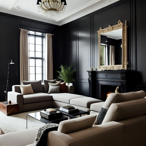
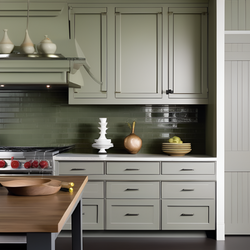
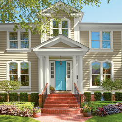
C2 Colour Profile - Missing Link (C2-894)

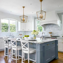
Although a monochrome neutral palette can often come across as being somewhat one-note, we add needed dimension and scale through layering with color and texture. The general tenor of neutrals has been much loved for decades because of their ability to feel classic and timeless and for how they manipulate easily with changing seasonal furnishings. But tastes change, and we seek more complex neutrals that still allow the freedom to mix shades that tonally harmonize but with a different pulse for a gentler, warmer, more natural environment.

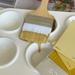
Layer Up Using Missing Link
As with any colour, it is always beneficial to determine the undertone to guide you to the best pairing partners. Missing Link, chosen for its warm undertones hint at soft ochre, adds an unmistakable luminosity and natural feel. Similar mellow neutrals in the yellow and red family work effortlessly here, or for stronger contrast, add something with a greener, more olivey undertone or a deep water inky blue. Layer in warm copper or burnished brass accents, natural or waxed woods to get creative. Paint trim and doors in a shade variation to walls, or apply a higher sheen on ceilings. Another top-shelf trend is ‘splitting colours’ on interior doors for extra character and personality.

You can also layer and add depth by layering textures of the same tone. Layering textures of the same tone provides a golden opportunity to expand on the dominant neutral colour. This style welcomes alternate finishes and sheens with paint and hard surface materials, add patterns and embossed textures to soft furnishing accent pieces or a darker toned textural rug to anchor the room.
Accent Colors:
Missing Link, being a warm mid-tone neutral loves any shades of warm white, black, brown, oyster like taupes, creams, watery blues, or as a more surprising accent colour try Mojo (C2-553) or Savannah (C2-543).
- OMBRE: For a tone on tone ombre gradation, try Missing Link (C2-894), Smidgeon (C2-912) and Sea Salt (C2-890).

- MOODY: Use darker wood tones like walnut with rich, saturated blues like Blue Grotto (C2-726).

- EARTHY: To head into an earthy, grounding palette, pair Missing Link with Katsura (C2-921) and Amazon (C2-917).

- JAPANDI: For light, calm Japandi effect, pair Missing Link with Cotton (C2-836) and Paper Clip (C2-928), which can always handle a touch of black Aperture (C2-981).

Need help choosing a color that’s perfect for you and your space? Just click here!
Also in Color Confidential


Recent Articles
- What Paint Should I Use? Your Guide to the Right Product for Each Room
- How Builders Using C2 Paint to Position Themselves as Industry Leaders
- These Paint Color Palettes Can Transform Your Smaller Bathroom into a Luxurious Respite
- 5 Ways to Harness the Power of Color in Your Interior and Exterior Paint Projects
- The Ten Commandments of Choosing Color

- Refresh Your Home This Spring: Top Painting Projects (Plus Recommended Products!)
- The Ultimate Guide to Choosing the Perfect Deck Stain for Your Home
- Painting Kitchen Cabinets: Your DIY Guide to a Perfect Finish
- Boosting Your Home's Value: 6 Home Improvement Projects for Maximum ROI
- Supercharge Your Aspirations by Choosing the Right Paint Color