Color is the fastest way to make a room feel warmer. Not "warmer" in the abstract, interior-magazine sense. Actually warmer. The kind of warm where you walk in, sit down, and don't want to get up.
The trick is picking colors with enough going on beneath the surface to hold that feeling across different light, different times of day, different seasons. Flat color fades under lamplight. Complex color gets better.
Here's what we'd paint if we were building a cozy room from scratch.
Warm Paint Colors for a Cozy Atmosphere
Rich Earth Tones

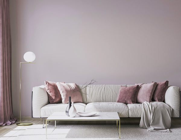
Earth tones do most of the heavy lifting in cozy rooms. Terra cottas, warm ochres, clay-touched browns. They pair with every natural material you can throw at them — wood, leather, wool, stone — and they make a room feel grounded without dragging it down.
C2 Berry Brown is our go-to deep terra cotta. C2 Raku, our 2025 Color of the Year, is harder to pin down — it reads as oxidized brown in morning light and tips toward burgundy at night. That's what happens when you blend 7+ pigments into a single color instead of two or three.
If you want the warmth of earth tones without going that dark, C2 Earth has a sunbaked, raw-clay quality, and C2 Tiramisu sits in cedar-copper territory. Both read warm from across the room but reveal more when you get close.
Soft, Warm Neutrals

Most neutrals go dead in low light. That's the whole problem with using them in cozy spaces — they need the thing (warmth, depth, presence) that neutral is supposed to mean "without."
The fix is undertone. A neutral with yellow, pink, or olive undertones stays warm when the sun drops. A neutral built from multiple pigments holds those undertones instead of losing them.
C2 Lumen is a warm white that catches light and throws it back with a glow. Not yellow. Just warm. C2 Smidgeon is our bestselling greige — it walks the line between gray and beige so well that designers keep coming back to it. C2 Parador goes a step further: taupe with olive and mushroom underneath, named after the old Spanish inns known for rustic elegance. It's a lot of color for a neutral.
Our 2026 Color of the Year, C2 Epernay, is a refined ochre with mineral undertones. If you're drawn to the idea of warm neutrals but want something with a little more point of view, start there. The whole En Terre palette was built around it.
Not sure which neutral is right for your light? Philippa, our color consultant, has been solving that exact problem for 30 years. Her recommendations are personalized, and she'll send samples.
Moody Blues and Greens

People think of blue and green as cool. They can be. But push a blue into navy or a green into forest, and you end up with some of the warmest-feeling rooms you'll ever sit in. Dark saturated color absorbs light and pulls the walls in. The room contracts around you in a good way.
C2 Moody Blue is velvety and shifts through the day — calm but not static. C2 Foliage is dense forest green, the kind of color that makes furniture look better just by being behind it. And C2 Bluegrass balances blue and green with enough warmth in its undertone that it reads cozy rather than clinical.
These deeper shades are at their best in rooms designed for settling in. Reading nooks. Bedrooms. Living rooms where the TV isn't the main event. Browse our full blue and green collections for more options across the spectrum.
Deep Purples and Warm Reds

Purple is underrated for coziness. Deep plums and oxbloods add a layer of warmth that's different from what earth tones or blues can do — more velvet, more weight, more evening-in-a-library energy.
C2 Wicked is a smoky oxblood. Paint it on the walls, carry it across the trim and ceiling, and the room turns into something you don't want to leave. (More on that technique below.) C2 Speakeasy is a true oxblood with an earthier lean, and C2 Mulberry brings a smoky berry that splits the difference between red and purple.
For bedrooms or spaces where you want the warmth without the drama, C2 Bella Donna is a lavender gray. Soft, not sweet.
Take the Color Quiz if you want to narrow things down before ordering samples.
Techniques That Actually Matter
Pick the Right Sheen
This gets overlooked constantly. Sheen changes how a color behaves in a room as much as the color itself.
Matte and flat finishes absorb light, which softens color and makes walls feel quieter. That's what you want in a cozy room. Eggshell adds a little warmth without obvious shine. Go higher than that and you start reflecting light instead of absorbing it, which works against the intimate feeling you're building.
C2 has five sheens across our paint lines. For cozy rooms: matte on walls, eggshell on trim. Our Sheen Guide breaks down all five.
Color Drenching
You've probably seen this in every design feed lately: one color, everywhere. Walls, trim, ceiling, doors. All of it.
It works because it removes the visual interruptions. When trim is white and walls are dark, your eye bounces between them. When everything is one color, the edges of the room soften. The ceiling feels like it lifts. The space reads as one continuous thing wrapping around you.
Color drenching is tailor-made for the deeper shades. C2 Wicked fully drenched in a living room or dining room creates a cocooning effect that photographs can't quite capture — you have to stand in it. C2 Raku drenched in a smaller room (a powder bath, a study) turns it into an event. Even C2 Parador drenched in a bedroom gives you that wrapped-in feeling without going dark.
Work With Your Light
North-facing rooms skew cool. Pick colors with warm undertones (yellow, pink, red) to counterbalance. South-facing rooms amplify warmth, which means you can push into blues and greens without losing the cozy feeling.
This is where C2's color system matters in a practical way. We blend up to 8 pigments per color. That complexity means our colors shift with the light throughout the day instead of going flat. A single-pigment terra cotta looks one way at noon and washed out by dinner. A multi-pigment one keeps moving.
Test before you commit. Our $1 sample chips are painted with real C2 paint — not printer ink — so what you see on the chip is what goes on your wall. Tape them up, move them around, check them morning and night.
Room by Room

Living Rooms
A living room needs to feel warm enough to relax in and awake enough to gather in. Earth tones handle both. C2 Raku or C2 Tiramisu on the walls with C2 Lumen or C2 Paper Clip on the trim gives you a room that feels considered without being precious about it.
Want more contrast? A single wall in C2 Foliage or C2 Moody Blue adds depth and draws the eye without overwhelming the room. Add textured fabrics — wool, velvet, linen — and you're done.
See what other people keep reordering: best-selling colors.
Bedrooms
Bedrooms are where color drenching really shines. A fully drenched bedroom in C2 Wicked or a deep navy becomes a place you actually want to sleep, not just a room with a bed in it. If that feels like a big commitment, an accent wall behind the headboard in a deeper shade still changes the whole feel of the room.
For something quieter, C2 Bella Donna (lavender gray), C2 Smidgeon (greige), or C2 Balsam (muted green) all create the kind of calm that helps you actually unwind.
Putting Colors Together

The simplest rule: stick with colors that share undertones. Earth tones and muted greens both lean warm. Warm neutrals let deeper accent colors stand out without fighting.
For combinations built to work together, look at the En Terre palette or our curated color stacks.
Cozy is a feeling, but it's not magic. It's the right color, built with enough pigment complexity to hold up across every light condition, in the right sheen, applied with some intention. That's it.