Sensory Interior Design: How C2 Paint Colors Can Enhance Your Emotional Well-being
Our homes are sanctuaries that reflect and affect our emotional states. Because of this connection between our environment and emotions, sensory interior design plays a pivotal role. Color is a powerful tool to tap into our senses so consider this when choosing your next color for your space:
Colors That Calm

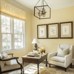
In spaces where tranquility is paramount, such as bedrooms and bathrooms, the colors should promote calmness and relaxation. C2 Paint offers hues like C2 Ella, a soft blue that evokes feelings of serenity reminiscent of a clear sky, perfect for calming a busy mind. Another serene choice is C2 En Pointe, a sophisticated, gentle near-white with subtle undertones that create a soft, clean backdrop, ideal for unwinding after a long day.
Energizing Spaces

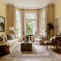
Conversely, there are rooms where we seek vibrancy and energy, such as kitchens and home gyms. Here, colors like C2 Torch, a bold and bright yellow with red undertones, can invigorate a space and stimulate mental activity, making it a great choice for areas where focus and energy are required. For those who prefer a more passionate tone, C2 Paprika, a rich brick red, can generate energy and enthusiasm, perfect for creative spaces.
Nurturing Neutrals

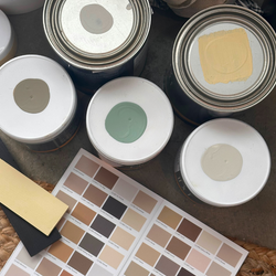
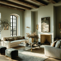
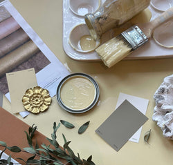
Neutral colors–especially those made with our full spectrum formula–are far from boring. They provide a sophisticated backdrop that can soothe and stabilize. Colors like C2 Archival, a warm soft gray, offer a comforting neutrality that works well in almost any room, promoting a sense of balance and stability. For a hint of warmth, C2 Sisal, a soft beige with a hint of green, brings a cozy and inviting atmosphere that makes any room feel like a safe and nurturing haven.
Reflective and Meditative Hues

If you’re looking for introspection, don’t be afraid to go bolder (if the tone is right). For a home office or library, the color choice should encourage focus and reflection. Our Color of the Year for 2025, C2 Raku, is inspired by the Japanese tea ceremony, with its deep mahogany undertones, creates a contemplative environment that enhances concentration and meditation. It shifts from a burnt red to a purple wine hue depending on the lighting, providing a rich, layered backdrop for thoughtful engagement.
Restorative Greens

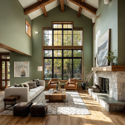
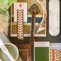
Green is known for its restorative qualities, evoking nature and growth, making it perfect for spaces that aim to rejuvenate and restore. C2 Rite of Spring, a soft, sage-like green, mirrors the calming essence of a lush field and is ideal for rooms that require a touch of nature’s peace.
Each color in the C2 Paint palette is more than just a shade; it's a step towards crafting a home environment that looks beautiful and feels right. By choosing the right colors, we create our personal retreats that cater to our emotional needs, making our homes true sanctuaries for both body and soul.


