Your Cart is Empty
All orders are processed within 1-2 business days, Mon-Fri., for regular and expedited orders.
All orders are processed within 1-2 business days, Mon-Fri., for regular and expedited orders.


Upgrade: 9 Tips for Sustainable Interior Design
Whether you need easy tips to help your client create a more sustainable home, or you are a DIYer with a clear vision in mind, we have effortless ways to incorporate sustainable design elements in your home.
Read More
A Fresh Focus on Grey 2020
Gone are the standard greys of the past decade. With a fresh focus on the undertones, greys are presenting themselves as soft lavenders, near blues and bold, deep tones that are refreshingly modern.
Read More
C2 Paint 2020 Color of the Year
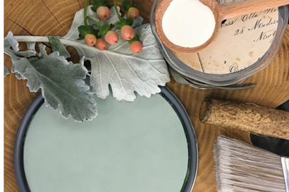
Our color of the year for 2020 is Salty Brine, C2-701. This rich hue floats effortlessly between green and blue, giving it a richness and depth that can only be found in nature. Like water, it is fluid and diverse, carrying organic notes that honor the natural world. This soothing color provides an inspiring backdrop to our search for global solutions that protect the environment, as the focus towards sustainability becomes more of a daily intention. Salty Brine’s complex undertones emit a harmonic frequency to aid in our journey for deeper meaning and purpose beyond material possessions.

C2 Color of the Month: Blue
What lies between violet and green on the spectrum of visible light? The most popular color on the spectrum: Blue. One of the three primary colour pigments in painting and traditional colour theory as well as in the RGB colour model, it consistently ranks as the most popular colour in America
Read More
COLOR OF THE MONTH: WHITE
While white is often considered a simple color, choosing the right white paint color can be quite confusing. White’s infinite range and numerous undertones confirm the complexities of working with this shade, reminding us of the mysteries it possesses. We have some tips to help you choose the perfect shade.

WAIT, YOU NEED THIS: TINY HOMES
The premise of investing in a smaller home is that it allows you to simplify life and consume less. The motivation can be financial, environmental, or simply wanting more freedom from the conventional way of life. To be able to do the things you really want to do without feeling physically and financially trapped.
Read More Recent Articles
- Creating Cozy Spaces: Paint Colors for a Comforting Home

- Embracing the Bold with Color Drenching

- 10 Things to Avoid When Painting Kitchen Cabinets

- Easy and Efficient Paint Projects to Transform Your Home for the Holidays

- Sensory Interior Design: How C2 Paint Colors Can Enhance Your Emotional Well-being

- How to Choose the Right Paint Finish for Your Project

- Home Projects to Finish Before the Chill Sets In

- Nooks and Niches: Crafting Your Cozy Sanctuary

- Refreshing Your Home for Fall: Embrace the New Season with Style and Comfort

- Infusing Comfort into Your Home Through Color and Creativity

Subscribe
Sign up to get the latest on sales, new releases and more …
×
There’s a C2 Paint Dealer near you!
Visit the store to get exceptional, in-person service. Click below to see store details
See My Store


