Your Cart is Empty
C2 Paint - 2018 Palette Preview
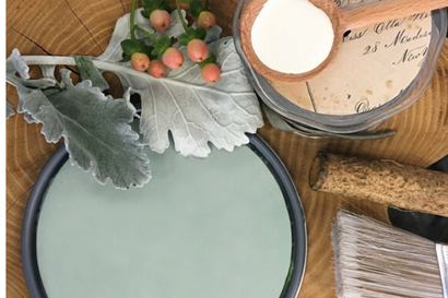
THE 2018 C2 PALETTE PREVIEW REPRESENTS A GENERAL MOVEMENT TOWARD SIMPLICITY;
A QUEST FOR NATURE; AN INNATE NEED FOR PERSONAL CONNECTION
AND SUPPORT BEYOND THE REACHES OF TECHNOLOGY,
AND A DESIRE FOR PEOPLE TO RECONNECT WITH THEIR NATURAL STATE.
A QUEST FOR NATURE; AN INNATE NEED FOR PERSONAL CONNECTION
AND SUPPORT BEYOND THE REACHES OF TECHNOLOGY,
AND A DESIRE FOR PEOPLE TO RECONNECT WITH THEIR NATURAL STATE.
Click Color Daubs to View Designer Notes
 Aperture - C2-981 |
 Seraph - C2-992 |
 Silver Screen - C2-974 Silver Screen - C2-974 |
 Coco Malt - C2-796 |
 Sheer - C2-804 |
Colors that appear on your screen are for digital viewing only. Please order a color sample for a true color match.
"We see a real need for authenticity, harmony and connectivity. This quest for balance is expressed through the application of lights with darks, neutrals with metallic, minimalism with organics, the dramatic with the natural and luxury with frugality."
— PHILIPPA RADON —
Interior Designer
— PHILIPPA RADON —
Interior Designer

Introducing the 2018 C2 Palette, a collection of some of our most dynamic colors, with an artful eye toward the trends and momentum of the current design industry. When we decided to choose a color palette for 2018, we wanted to approach it from a unique angle. Instead of researching outside influences and trends, our instinct was to look to our dealers for real-world input: What are people looking for? What trends are resonating in their market—from fabrics and architecture to fashion and finishes? What conversations are taking place in their store? What is the mood of their customers?
We discovered many common threads: a general movement toward simplicity; a quest for nature; an innate need for personal connection and support beyond the reaches of technology, and a desire for people to reconnect with their natural state. According to interior designer Philippa Radon, "We see a real need for authenticity, harmony and connectivity. This quest for balance is expressed through the application of lights with darks, neutrals with metallic, minimalism with organics, the dramatic with the natural and luxury with frugality."
Because our curated color palette represents the full spectrum of visible light, the colors are naturally complimentary, creating a sense of beauty and balance, which makes color selection easy and foolproof. Their natural harmony with each other – and with the design elements in a room – further affirms the importance of maintaining a kinship with nature and with each other.