COLOR OF THE MONTH: GREEN

Color Expert, Philippa Radon cultivated her signature color-based design philosophy through many years of developing her professionally trained eye in the industry. Working with high profile British and U.S. designers, her work as a colour consultant led her to establish her own full-service design firm where she is immersed in a world of colour and design. She recently relocated from Los Angeles to Western NY, where her husband was born and raised. Always inspired by the beauty of her own “work in progress’ farmhouse and its surroundings, she brings her attunement to nature back to the energetic pulse of city life, claiming that “the chickens keep her honest.”
The word ‘querencia’ comes to mind when I think of the color wheel’s most verdant hue; which means a place where one feels safe; a place from which one’s strength of character is drawn. And also? A place where everything becomes possible because of it.
Despite the fact that it was the colour of my school uniform at a young age, I’ve always had a love for the colour green in all of its glory, variation, and range. It is instantly calming and stabilizing, rich and embracing, it transports me to impossible places. Be it the deep dark emeralds of Oz, or the more in-between versions found where the sea meets the sky.

Philippa working in her studio
A color that needs no introduction
Every colour has that ability for all of us, we just have to find the right code (and combinations) to unlock its power. And it is no secret that green has brilliant branding potential. For proof, look no further than the logos of Starbucks or Animal Planet, two energetic brands paying homage to its commercial value and symbolic references to nature and discovery.

A Kaleidoscope of Colors
Green has been teetering on the cusp of the design world for a while now, and with the immense range it has to offer (green is said to have more variations than any other colour on the spectrum), it deserves its rightful place in the color trend spotlight. From sophisticated pale buttery leafy greens to loud, bright citrus/limes and intense glaucus grey greens. Last year, we had an olive and khaki moment, supported by a camo print resurgence wherein green teamed with a kaleidoscope of blues and pinks; or muted greige and spruces, bordering on black.
Green is integrated into so much of our daily world, especially as it relates to food and nutrition, with media coverage calling “greens” out as the literal key food group. Kiwi, wasabi, kelp, matcha, the feast of colors is endless.

Green: What’s In a Name?
Just the name, green conjures up a cornucopia of mental pictures: lush suburban lawns, Amazonian rain forests, or precious gems like emeralds and jade.
From the first signs of spring bursting forward with new growth and energy to the controversy of the medical marijuana industry and its branded green symbol.
And let’s not forget, its presence in the art world with the likes of Chagall, or the moody-soft backdrop depicted in the Mona Lisa. Green today has become a ubiquitous and soothing presence as the symbol of environmental causes and the mission to save the planet.
The green of past and present
In terms of recognition through history, it was connected as far back as the Roman Emperor Nero. It became the colour of Islam. Goethe deemed it the colour of the middle class, while artists Kandinsky and those of the Bauhaus movement denigrated it. Art historians believe that the controversy may stem from the fact that, as a color, green was universally unstable and therefore hard to produce. Thi is the very same reason that painters and poets delighted in celebrating and glorifying its romantic meadow landscapes, floral metaphors, and the like.

Roman mural from the Villa Livia | Rome 20 BCE
Granted, there are a few less-than-appealing applications woven throughout design history. Remember avocado green bathtubs and minty green hospital walls? Or the opulence of yesteryear’s Jaguar’s E-type convertible?
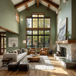
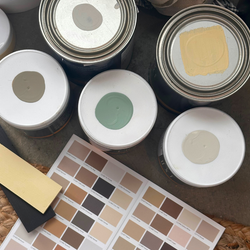
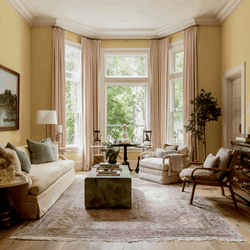
Using green color combinations to enhance your space
So this year, knowing that colour speaks louder than words, and the range of green is almost infinite, I’m in favor of celebrating this month’s colour in all of its verdant glory. And don’t forget we are always here to assist in real-time once you’re ready to order samples or start a new project of any size.

Try Wasabi (C2-666) with Sashay (C2-515) for a little girls room
Blackened Pearl (C2-677) or Mediterranean (C2-709) stand on their own with a host of options, but try a soft white, like Sheer (C2-804) or Chit Chat (C2-964) as a crisp ceiling accent. Or even a warmer light neutral like Ferrous (C2-995).

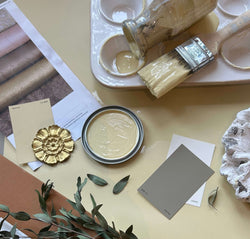
Olive Branch (C2-938) is one I love with a hint of something paler in the same family like Gimlet (C2- 945).
Bright and vibrant Kiwi (C2-655) with crisp white trim for a refresh of green with lots of charm and energy.


