The Creative Comforts of Winter Hibernation
by Philippa Radon
As the autumn leaves begin to fall around our newly purchased farmhouse (another story to be told) and I see our neighbors’ iconic red barn, now glaringly exposed through bare trees, I can’t help but wonder what’s in store for us here in Buffalo as the barometer drops.
I try to imagine the sea of white that will inevitably surround us, replacing the current carpet of copper and luminous gold, and am inspired to push my level of creativity to consider the key factors that will make my new home cozy, warm and seasonally colourful—without breaking the bank.
Our homes provide a sense of belonging, and winter is a time to hunker down, take stock & focus on our direct and personal surrounding – make design an adventure, with joy and self gratification the compass guide. We need to see the things we craft and make, and feel the results. Colour provides an immediate embracement of our work, that we can share and enjoy.
Eden, our new home, is located in an agricultural zone and snow belt. As a new Buffalonian, with my second winter fast approaching, I am told that snow often starts as early as late October, which sends me into accelerated “prep’ers” mode.

My new home, Eden in Buffalo, NY.
These preparations include not only the practicalities, but also more comforting practices like nest building and some intensified colour reflection. My tendencies, especially in the colder months, lean toward creating a warm, inviting colour palette that will keep us inspired to embrace the coming months of hibernation in my transforming hygge home.
More often than not, a colour selection leads the way for my design aesthetic, whether it’s a paint colour or textile – but in circumstances like this, when I have nothing but an empty shell and only three finished walls, my inspiration often becomes stalled by overthinking…so I wait it out.

The outdoors provide constant inspiration.
And when I least expect it, a new idea arises – usually triggered by a visual in my daily maneuverings – that period of recognition that I’ve discovered my new “starting point”. From this moment, I can commence mapping out the rest of the space, with careful consideration to my colour viewpoints. This is what I refer to as my “mapping technique” (which I will share with you at a later date).

This takes “in progress” to a whole new level…Lots of work to be done.
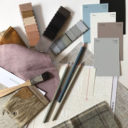
I find myself yearning for colours that will provide a sense of flow and continuity through the rooms in this 1890’s frame, but also a grouping that is unpredictable. A dark dining room allures me with its mystery. C2 offers a beautiful range of “near blacks” that will compliment my new metal-beaded, oversized chandelier – an investment from BoBo Intriguing Objects (which I am still trying to learn to install without my husband noticing the beast.)

Seeking inspiration from one of my favorite places, Beekman 1802.
Perhaps Stout, a deep, rich grey would be an appropriate color…or Aperture, a sort of dirtied green-black with an earthy appeal.

The beautiful, harmonious colors of nature inspire my design.
These colours elicit feelings of happiness, optimism and energy despite their dark moodiness – and also provide a classic and welcoming background to virtually any design. The draw toward these deep, rich tones sounds like winter magic to me.


