by Tia Clarida
San Francisco-based Artist Lucky Rapp is a self-taught visual artist with a background in fashion and art. Her methodology incorporates layers of resin, paint, and acrylic forms that create texture and depth within the dialogue of her work. Lucky’s approach is process-oriented, physical and often text-based. The end result combines inquisitive statements that play with both language and the potency of graphic communication, while the three-dimensional nature of the layered resin fosters a sculptural reflective quality.
I spoke to Lucky about her latest project with ArtHaus Gallery and the integration of C2 Paint in her work.

Can you tell us a little bit about yourself and how you came upon art as a profession?
I was a window decorator at Engelhorn und Sturm in Mannheim Germany. This job ignited my creativity, though I was not yet a full-time artist. At the time, I had an art gallery in my apartment called Gallery 7 with themed concepts, from the invitations to the install of the Venesages. Every 3 months, I would have an art opening, drawing crowds of people. It was great fun! I serendipitously returned to San Francisco, working first at La Boulange because it was the easiest transition coming from living in Paris and Germany to becoming a full-time artist. I wanted to work with the same product I used many times at Engelhorn und Sturm to seal paint. It would make the paint crackle and age like it was from the 1800’s. It would cause rashes on my neck and wrists. Through this research, I found resin, which is also a toxic substance before cured. I seem to be attracted to toxic substances. In time, I was working at La Boulange full-time and on my art full-time. I decided to take the risk and focus on my artwork and turn to it as a profession.
What’s the biggest risk you’ve taken for art?
The biggest risk I’ve taken is a combination of things such as investing time, labor, and materials in large pieces, expression through words and working with propane and epoxy resin. There are a lot of logistics when pouring resin. The particular resin I use has an approximate 10 minute working time before it starts to react and thicken so it is very risky to pour multiple pieces at once. I have to meticulously plan which pieces can be poured on a specific day and then wait for them to cure before moving onto another batch or layer.
Using propane and epoxy resin is always a great risk and takes full concentration on every level. I have to wear full-body protective PPE and a mask that protects my eyes and lungs from solvents. Additionally, I have to observe weather conditions like temperature, humidity, and wind which can change the workability and cure time of the resin. There are so many elements and factors at play.
Word choices are always risky. Art is left to interpretation and when your artwork includes text sometimes it can be even more so. Words are subject to both interpretation and misinterpretation of the messages I'm trying to convey.
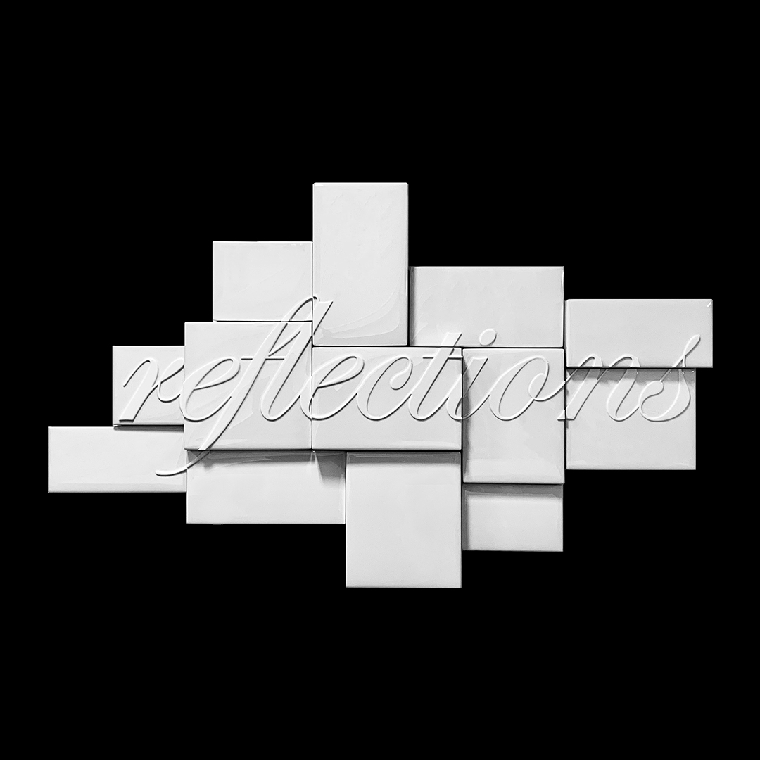
A piece that comes to mind that encompasses all of these factors is my largest piece ‘reflections’ which is a puzzle-like collection of 13 panels in varying sizes and depths. Aside from the usual risks with epoxy resin and text, it was a project that took hours of designing and redesigning. It had to be looked at from all angles to see that it functioned visually. I had to think about the install of the piece as well as the individual pieces. I’ve installed it 4 times with Matt McKinley Art Solutions and it takes 4 hours using an install map that Matt created every single time. For a working artist, investing large amounts of time into one piece can be one of the largest risks.
Obviously, your name is cooler than most – how’d you grab such a good one?
I was living in Europe and dating someone in San Francisco. They worked at a hair salon in San Francisco where everybody had nicknames and all insisted I too needed to come up with a name for myself. I was walking with my BFF Dirk Benesch, a stylist, in Paris and deciding between Orlando, Romeo, and Lucky. We agreed that Lucky Rapp just sounded good. When the relationship ended they said to me, “you will never be able to keep that nickname!” My inside voice replied, “watch me”.
How were you introduced to C2 Paint?
I was introduced to C2 Paint by Caroline Lizarraga. I remember the day she entered my studio space like a summer breeze and bust of light proclaiming, “Lucky, you have to see this new color ‘cognac’, you are going to love it!" Her enthusiasm drove me to Craig’s Paint, a shop in SF that has since rebranded to Creative Paints, and I used C2 Paint’s Cognac - C2-617 in my next project in 2009! It was absolutely perfect for ‘a piece of my mind’, a series I created during a silent meditation in a jungle in Thailand on scraps of notebook paper. I wanted an old-world color that resembled vintage medical research books that one possibly found years later and might house cross-sections of the brain.

I fell in love with C2 Paint, for their story, for their colors, and for their names. I went on to interview Craig from Craig’s Paint about C2 Paint and created the series 'Paint Politics' in 2012 for FourSquared at ARC Gallery in San Francisco. I sold all 16 pieces opening night that were my iteration of supersized color swatch cards with the corresponding color codes.

My dream in 2012 was to recreate every color swatch in the entire C2 Paint color palette for the SF MOMA. I never met the right person to make this happen, but what a powerful series with 350+ C2 colors, 12" x 8.25". I still dream about creating this series, I'm just waiting for that day.
Throughout my career, I would turn to C2 Paint again and again to produce other series.
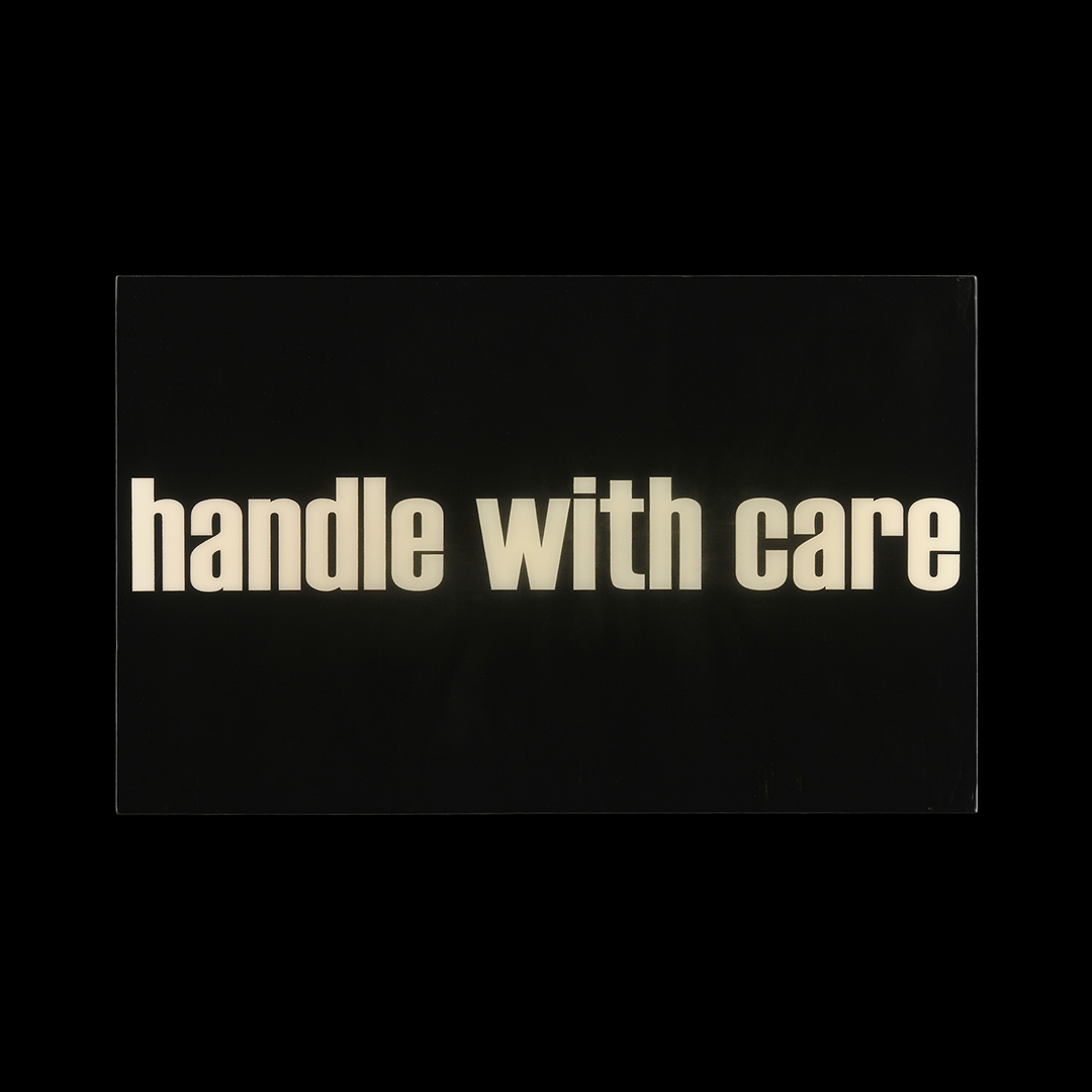
In 2013, I created the series 'c'est moi chérie' using trench coat beige and torch yellow as the underlying colors of this series using large-scale communication in the form of intimate messages. 'handle with care' a piece from this series is in the main Gallery at ArtHaus Gallery for their 25th Anniversary Exhibition SILVER ANNIVERSARY RETROSPECTIVE.
In 2016, I created another series for FourSquared at ARC Gallery called 'inappropriate' using C2 Paint’s Stout - C2-965, also suggested by Caroline Lizarraga.
In 2019, a series called ‘Color Blind’ used various C2 Paint colors as well.
Now, in 2021, my series ‘this too shall pass...’ in collaboration with C2 Paint and ArtHaus Gallery in San Francisco, utilizes 50 swatches from C2 Paint’s White Collection.

What was your motivation behind the current project with C2 Paint?
I created the first iteration of 'this too shall pass...' for a solo show 'COUNTING SHEEP' at Gallery 35 in Mannheim Germany in 2011. In 2020, My Sister living in LA commissioned a square format in all white 'this too shall pass...'. In the same year, another client, L.L. in Palo Alto commissioned another version of 'this too shall pass...' in the same style as the series '13 signs' using the C2 colors Milk Moustache - C2-692 and Purity. I ended up needing to start from scratch and recreate her commissioned piece. I turned the first piece into a raised text piece and my friends at Jafe Custom Finishing sprayed out a satin finish which was so perfect. This became the first piece in the “this too shall pass…” series in Architectural White with Satin Finish. A few days later at a photoshoot with ALMAC Camera, I asked Don Felton to take a photo of my gloves in the shot with the completed 'this too shall pass...' It was fun and whimsical and time-sensitive perfection.
I sent the image to James Bacchi at ArtHaus and said, "I bet if you post this, it will sell in 1 hour", he said his goal was by 5pm. Two hours later, the piece sold! It was a good moment in hard times, so you have to hold it when you have it. We began to develop the concept of ‘this too shall pass…’ in 50 different shades of white. As we got more and more excited, I wrote you at C2 Paint. Everything started coming together and here we are–39 pieces to go. The real concept behind this piece is that we all can agree we are waiting for this pandemic to pass...not a day goes by that I don't think about the day we can all safely roam free.
You chose to feature many of our whites, which are very nuanced and full spectrum (meaning, we don’t use black in any of our colors to keep the luminosity). How did you decide on the specific colors?
Honestly, I needed help and had to decide on all the colors. If you notice the pattern in this interview, I take Caroline Lizarrage's color advice not only because she is a stellar interior decorator and more, but because I'm colorblind. I sat for hours on C2 Paint’s website and looking through the fan deck. I’ve become very familiar with the C2 website navigation. I was interested in both the tone of color and the name of the color. I wanted variety but not too much saturation. I’m that person who will buy a book or magazine because I love the cover and never open it but keep it by the bedside just to look at. Imagery, color, and word association are most important to me.
How important is color to you and what makes a certain color “work” better than others?
Color is very important to me and being colorblind is a real challenge. I sometimes have to hire friends to tint my resin colors when I need to use custom colors. Due to the chemical balance of the solvents, paint colors can not be added to resin so the color has to be recreated using Mixol USA tints.
I used C2 Paint as the starting base colors in another series called 'Color Blind' in 2019 for FourSquared at ARC Gallery. I had C2 sample pints everywhere and had to label the pieces, the brushes, and the table. I could not move any of the 20 pieces from their position as to not mix up the colors.
Color can make or break a piece of art. I believe that color is representational of mood, message, and sentiment. Color carries the overall feeling of the art and that feeling is dependent on the imagery, words, or message.
Let’s talk about text…or fonts, more specifically. How do you choose which ones convey what message? (PS - I’m a font nerd :))
I could look at fonts for hours. I choose fonts dependent on language and message. I speak French, German, and Spanish and I feel like all languages have different feelings. French feels cursive and German feels bolder. Spanish also requires a different font choice. Fonts can also be very project-specific to convey a particular feeling.
I have a series called 'Jargon' that features phrases used in the military that have also been adopted for general, everyday use regardless of their original intent. The contrast of the identifiable military font and pop neon colors makes these whimsical messages both serious and playful at the same time.
Learn more about Lucky, how to order, and more about her upcoming projects:
Instagram: lucky_rapp
Facebook: luckyrappartist
In collaboration with ArtHaus Gallery and Consulting in San Francisco.