Creating Wellness Zones in Your Home: How to Use Color to Promote Well-Being
Your home isn’t just a place to sleep, eat, or relax—it's a sanctuary that should support your mental, physical, and emotional health. One of the most powerful ways to transform your space into a true haven is by creating wellness zones—specific areas dedicated to promoting different aspects of your well-being. These zones can help you unwind, focus, stay energized, or restore your body and mind. And one of the most impactful tools for creating these spaces is color. The right shades can enhance the atmosphere of each zone and subtly influence your mood and energy, making them a key part of designing a wellness-focused home.

The Power of Color in Wellness Zones
Color is more than just a visual element—it affects our mood, energy levels, and even our physical well-being. Thanks to color psychology, we know that certain hues can help calm the mind, boost creativity, promote relaxation, and inspire energy. By choosing the right colors for each zone in your home, you can create spaces that nurture your body and mind, improving your overall wellness.
Here’s how you can use color to create wellness zones that support relaxation, productivity, and connection.
1. Relaxation Zone: Promote Calm and Stress Relief

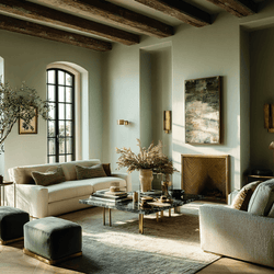
The relaxation zone is your sanctuary for unwinding after a busy day. Whether it’s a cozy reading nook, a serene bedroom, or a peaceful meditation corner, the colors here should help you relax, reduce stress, and promote restful activities. Soft, calming tones work wonders in creating a soothing atmosphere.
Soft blues, greens, and lavenders to create a calming atmosphere. These hues are scientifically proven to reduce anxiety and promote relaxation.
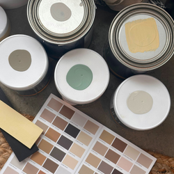
- C2 Mineral – This cool, muted gray-green, inspired by natural stone, brings a grounded, calming feel to any space. Its understated elegance helps to evoke tranquility and peace.
-
C2 Argyle – A soft, muted blue with gray undertones, creating a balanced and serene atmosphere, ideal for relaxation.
-
C2 Bella Donna – A timeless mix of gray and violet, offering a sophisticated, bohemian vibe that encourages deep relaxation.
2. Focus Zone: Boost Productivity and Clarity

Whether it’s your home office, a study nook, or a creative workspace, your focus zone should foster mental clarity, concentration, and energy. The right colors can help you stay productive and focused without overwhelming you.
Yellow is great for stimulating creativity and intellectual energy, while blue promotes focus and calm. Use these hues to create a productive environment where you can thrive.
-
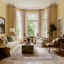
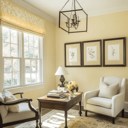
C2 Pale Ale – A sophisticated, fresh yellow that energizes the space and sparks creativity. Perfect for a kitchen, art studio, or workspace.
-
C2 Brigand – A deep, rich blue that promotes concentration by reducing distractions, making it an ideal choice for a study or home office.
3. Energizing Zone: Activate the Body and Spirit

The energizing zone is all about movement and vitality. Whether it's a home gym, yoga studio, or a playroom for the kids, this space should inspire activity and invigorate your senses. Bright, bold colors are your best friend in this area.
Colors like red, orange, and yellow stimulate the senses and encourage physical activity. These colors are perfect for spaces meant to activate the body and energize your spirit.
-
C2 Savannah – A bold, energizing red that encourages movement and boosts adrenaline, perfect for a workout space or high-energy family room.
-
C2 Labrador – A cheerful yellow that radiates optimism and energy, ideal for spaces where fun and activity happen, like a playroom or family room.
4. Restorative Zone: Recharge and Restore Your Body

The restorative zone is where you go to unwind, recharge, and restore your body and mind. Whether it’s a spa-like bathroom, a cozy corner for meditation, or a peaceful bedroom, the colors here should promote healing and relaxation.
Soft purples, blues, and greens are ideal for this zone. They promote emotional healing, relaxation, and restful sleep, helping you feel rejuvenated and refreshed.
-
C2 Nightcap – A luxurious lavender that encourages deep relaxation and emotional healing, perfect for a calming bathroom or meditation space.
-
C2 Oxygen – A soft, soothing blue that promotes relaxation and sleep, ideal for a restorative bedroom or quiet corner.
5. Social Zone: Encourage Interaction and Connection
Your social zone is where connections happen—whether it’s a living room, dining area, or entertainment space. The colors here should foster communication, warmth, and a welcoming vibe, encouraging social interaction and positive energy.
Warm tones like red, orange, and peach encourage social interaction, while fresh greens and soft neutrals provide a balanced environment where people feel both relaxed and energized.
-
C2 Paprika – A warm, earthy red that invites conversation and adds a cozy, welcoming touch to living or dining areas.
-
C2 Path – A refreshing, vibrant green that offers both energy and calm, perfect for spaces where family and friends gather.
Tips for Integrating Color into Your Wellness Zones
Now that we’ve explored how different colors can enhance specific wellness zones, here are some creative ideas for integrating color into your home design.
-
Use Color to Define Areas in Open Spaces
In open-plan homes, use color to visually separate different wellness zones. For example, create a relaxing corner with soft blues or greens, while using bold yellows or oranges to energize a family or play area. This helps each zone feel distinct and intentional, while still maintaining a cohesive look. -
Add Color Through Furniture and Decor
If you’re hesitant about painting entire walls, try incorporating color through smaller elements like furniture, pillows, rugs, or artwork. These accents allow you to define your wellness zones without making a permanent commitment to a wall color. -
Lighting Matters
Lighting is essential for setting the right tone in each zone. Pair your color choices with lighting that complements the mood. Soft, warm lighting works wonders in calming spaces, while bright, natural light can help energize your focus and social zones. -
Mind the Flow Between Zones
While each wellness zone may have its own distinct colors, it's important to maintain a smooth transition between spaces. Use neutral accents or complementary colors to create a harmonious flow throughout your home. -
Personalize Your Wellness Zones
Don’t forget to add personal touches to each zone. Whether it’s a favorite piece of art, a cozy blanket, or a beautiful plant, these small details help make each space uniquely yours, enhancing its wellness benefits.
View our Wellness Color Collection
Designing wellness zones in your home using color is one of the most powerful ways to create a space that supports your mind, body, and spirit. From a calming bedroom in serene blues to an energizing gym in vibrant reds, color can help transform your home into a sanctuary that promotes your overall well-being. By thoughtfully incorporating color into each zone, you’ll design spaces that are not only beautiful but also work with you to boost your mood, enhance relaxation, and foster productivity.
So, what will your wellness zones look like? Whether you’re creating a peaceful retreat in lavender, a productive workspace in blue, or an inviting social area in warm tones, let color guide the way to a more balanced and healthier home.


