COLOR OF THE MONTH: ORANGE

Color Expert, Philippa Radon cultivated her signature color-based design philosophy through many years of developing her professionally trained eye in the industry. Working with high profile British and U.S. designers, her work as a colour consultant led her to establish her own full-service design firm where she is immersed in a world of colour and design. She recently relocated from Los Angeles to Western NY, where her husband was born and raised. Always inspired by the beauty of her own “work in progress’ farmhouse and its surroundings, she brings her attunement to nature back to the energetic pulse of city life, claiming that “the chickens keep her honest.”
“Color is an element, not a trimming.”
— Famed photographer, typographe, and graphic designer Piet Zwart
Harnessing an awareness of how a colour makes you feel, and discovering what most resonates with you takes a keen interest and curiosity. Interpretation of color is subjective, and in my opinion and practice, should not be trend-driven but freely personal. Though I appreciate the appeal of colour trends, knowing what really works for you contributes to a sense of well-being, balance, and mood. The latter being my focus when selecting colours.
So, with all it promises to deliver, perhaps orange should be more strongly considered. It is the perfect colour to shake things up a little or a lot! Perhaps, some of the current trend photos will serve to inspire something new, different and surprisingly pleasing.

THE PROMISE OF ORANGE
Orange is the colour of encouragement; it conveys enthusiasm, excitement, joy, and warmth. It reflects the spirit of the eternal optimist, the artist, freedom of expression, determination, health, sunshine, ambition, security, independence, endurance, flexibility… success, generosity, humanism — should I go on?! So it’s no wonder that it is often used with trepidation and respect. Today, design is taking a much-needed break from the tried and true, more timid, neutral palettes and opening the door for more emboldened adventures.
I am always curious to know the backstory of anything. The why. It helps me produce better and more purposeful work, and gives meaning to the craft. So perhaps the calling for orange, the burst of energy it infuses us with, will lift our spirits up and out as we sluggishly emerge from winter hibernation.

ORANGE CRUSH
In my view, orange is a pretty cultured colour. Rather sophisticated and more European in popularity, it is somewhat controversial and has a tendency to be reliant on a colour partner to help it perform at its best. Orange will dominate and monopolize space in the best way possible. The deep, more dramatic versions pair handsomely with muddied olive greens, or graphite with a touch of brassy bling for striking elegance. At times, if not handled well, it can be unashamedly loud, or appear childish and display its more garish characteristics.
Orange offers such a diverse range of colour. From the palest of soothing melon tones, which lend an illuminating and interesting vibe to richer saffron and turmeric. Or the more mouth-watering sorbets and the popular peachy versions. Fiery Arizona clay and baked earth head us into the deeper side of range along with the magnificent, saturated Tang orange variations that add a contemporary flair. No wonder this colour has the ability to help heal a person recovering from disappointments, a wounded heart, or a blow to one’s pride.

Artist, Mark Rothko in his more mature period during the mid 50’s, with work that went beyond abstract to embody the drama of humanity. He favoured orange on red to deliver his message.
When using orange, think about the mood you want to create and the context of the colour in the space, and pick the tone of orange you love that most reflect this. Consider if it is to be used as an accent introduction, or intended as a major statement. For a more retro look, pair with warm browns, mid-avocado greens, and a third neutral colour for balance. For a contemporary feel, pair lapis and deeper turquoise blues. Opt for a high-chroma yellow, pink, and orange tonal layerings for something boldly harmonious.
SEEN IN NATURE AND CULTURE
In nature, orange is commonly associated with warm, long summer days, intense sunsets and being the main colour of harvest and autumn. It also happens to be a sacred and auspicious colour in Hinduism. And is the sacral chakra colour of vitality and strength.

Photo by Peter Hershey

In an Orange World by one of my beloved painters, Wolf Kahn. Kahn says, “Orange is very blatant and vulgar. It makes you immediately start having feelings.”
Tell us, how will you incorporate orange into your next project? Share in the comments!Recent Articles
-
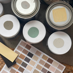
How to Properly Test Paint Color Samples for Picture-Perfect Results
-
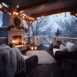
10 Winter Home Projects To Tackle Before the Holidays
-
The Gift That Keeps on Giving: The Power of Paint and Color
-
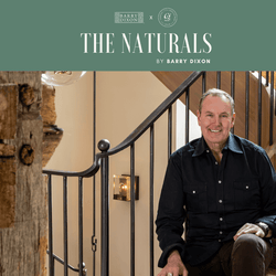
The Naturals by Barry Dixon: A Color Story Inspired by Life Outdoors
-
How to Use the 2026 Color of the Year, C2 Epernay and the En Terre Palette to Transform Your Home
-
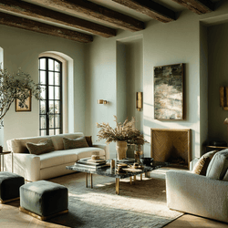
Color of the Year 2026: A Return to Craft, Artistry, and Nature
-
Fall Home Projects: Why C2 Guard Is the Best Wood Sealer for Fall
-
Simple Upgrades for a Colorful, Cozy Home
-
Mellow Yellows: How to Use This Sophisticated Hue in Interior and Exterior Design
-
What Makes C2 Guard Different? The Science Behind Better Wood Protection


