Design Detail: Interview with Designer James Huniford
![]()
Designer James Huniford, known to most as Ford, has been described as "rough-refined" and "a master of mixing the old with the new". As the founder of Huniford Design Studio in New York, he embraces spaces that are balanced, elegant, and comfortable -- and always representative of the people who inhabit them.
______________

In our recent interview, we discussed everything from his recent Elle Décor feature to the inspiration behind his Huniford furniture collection (hint: it involves flea markets) to his love of shapes and unique objects. With an easy down to earth demeanor, he gave us a glimpse into his life, his work, and his inspiration.
______________
Were you one of those people who knew early on what you wanted to do with your life?
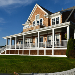
I always loved interiors. I spent my childhood on the Saint Lawrence river up on the US and Canadian border where there was just incredible architecture and design from turn of the century houses. Very beautiful, American, shingle-style architecture, but a lot of the interiors were English and graceful, early American furniture and rock outcroppings. That was always interesting to me.
How did that influence your design sense?
I'm not one for fussy, but I love interesting objects and shapes and forms. I think great architecture and interiors are about significant volumes.
One of your projects was recently featured in Elle Decor. Can you tell us about it?
It was a house I worked on for a couple of years. It's on a beautiful piece of property, 100 acres overlooking this incredible lake high up on a hill with a lot of rock outcropping, surrounded by nature. It's for a family with two children who have been very close friends of mine for many years. So, I think that really raised the level of expectations for me to make sure I did something extraordinary. Because we have that kind of relationship and history, I was able to take risks that were interesting.
Early on in the project, one of them wanted to open up the ceiling in the second entry hall and make a double-height ceiling from the staircase. Move a bathroom to the other part of the house, which kind of was the turning point for the whole job to make it something really extraordinary and special.


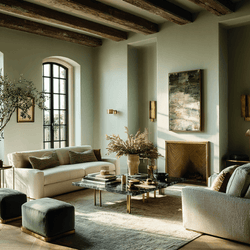
Combining what were three rooms, connecting the kitchen into one larger room, but with some kind of structural supports. Simple things like blue and white linoleum floors in the kitchen, instead of some fancy marble. A lot of playful wallpapers with patterns and prints and flora. With just very chalky white Celadon walls.
You love white walls. Would you say that's a true statement?
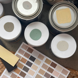
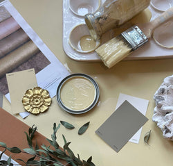
I like walls that appear to be white, but they're usually not. They typically have a tone of gray or a tone of green. I think that's the essence of what captures your eye. I'm not one for cold, photographer's white. I like warmer colors that, depending on the sun and the shadows, can be read as different colors. In my own house in Bridgehampton, I have C2 Paint, and sometimes it looks white. Sometimes it looks like a wash moss color. Other times it looks like it has a hint of blue to it.
That's the result of using full-spectrum colors, which doesn't have black, which dulls the color. It reacts with the light, which is what our customers love.
Well, I think what I'm drawn to C2 for is the richness in their pigment, because you really see the true value of the color. I've been a fan of C2 for 15 years.
Do you have any favorite C2 colors that you use?
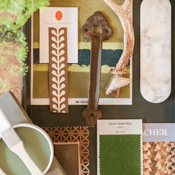
Yes, really the same colors I used in my home which are:
How have you adjusted your process due to COVID?
Since COVID, we've had two big presentations that were Zoom presentations, and they went really well. I had called both clients the day before and talked about what we were going to be presenting. So there was some one-on-one dialogue on the phone before the Zoom call. Just talking with them room by room of what to expect. So, when we were live, there wasn't a lot of unknown which was really helpful. I work closely with my clients. I like their opinions. I like to hear what their point of view is. I try to understand what their lifestyle is all about, so I can hopefully expand beyond their expectations.
How do you tow that fine line between what your clients want and what you recommend?
Some clients are open to expanding beyond their comfort level, and others aren't. That's the unique process of working with an interior designer and having that level of trust in knowing how far to go.
At the end of the day, it's their house, and they're the ones who are living there. If I'm not a good listener, then I'm not doing my job well.
Do you have a specific type of room or style of home that is your favorite to design?
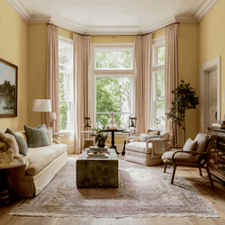
I love living rooms because I love space planning, exploring furniture placement, and doing things in an unexpected way. Of not having a traditional layout of the sofa in the middle of the room with four chairs around it. Like having two smaller settees instead of one big sofa. Scale is very important in today's world. That there's so much mass-produced furniture that's over-scaled, but once you get it into a room, it just kind of all feels dwarfed. Or it feels over-scaled, and you feel like there's this barge in the middle of your living room and you don't know what to do about it.
Your Huniford Collection of furniture is stunning. What inspires such unique pieces?

A lot of the collection is inspired by things I've seen, usually in the Paris flea market, which I love. Finding shapes and forms and also making sure it's comfortable. I tend to like upholstered furniture that's up off the floor with no skirts because it kind of flows and it's a bit more streamlined. Which is more my sensibility. I don't like matched sets. If it's more like a Jean-Michel Frank square armed sofa, I'd like a chair next to it with an oval or a rounded arm. I love wing chairs and shapes of furniture that's sculptural. Whether it's the contrast between a fabric seat and then a wooden arm. Or a curved back up on wooden legs. I think that's always very interesting. So it doesn't look so kind of head to toe, as I say.
You have a book that's about to launch. How exciting!
Yes, my upcoming book James Huniford: At Home is being published by The Monacelli Press. This is my first book and I am very excited to share my work and approach to design with readers.
How can we get our hands on it?
The book comes out in November but you can pre-order a copy here.
Can you tell us a bit about your charity, Design on a Dime?
Design on a Dime is an event that I started 15 years ago. It's about supporting homeless people with AIDS and HIV through the design community. We've raised nearly 20 million dollars for housing and creating shelters and job training programs. It's been extraordinary. Pretty much every major designer has been involved in some way. From Michael Smith to Steven Gambrel to Bunny Williams to the chairman of Hermès to Lenny Kravitz, to the cast of Girls. It's just been an extraordinary thing. Proceeds go toward Housing Works' initiative to end homelessness and AIDS in New York City.
TO DO LIST!
Learn more about Ford Huniford and his collections
Learn more about Design on a Dime


