Take the Color Plunge! Color Profile: Portuguese Dawn
There’s a defining moment when it comes to color for some of us – an imaginary line we cross that’s filled with bravery, boldness, and unwavering confidence to heed/honor our creative spirit. Its purpose is to pull us out of the neutral zone into something decidedly more colorful and edgy.

It takes a leap of faith and a dash of bravery (or even a midday glass of Pinot) to take the color plunge. It also requires a dedicated vision to maintain your course. Vision brings clarity and insight into defining your style direction. But just imagine the joy, the sense of accomplishment, and deep-felt satisfaction, when you cross the finishing line to experience and thrive in a room that totally embraces you, that has meaning to you, and exudes your style, your way.
A clear vision delivers the clarity and insight to define your style direction. Sometimes you see more clearly when you stretch the boundaries.
If you’re looking to dive into the world of color, these steps will help you feel more confident and enjoy the adventure!
1. Choose:
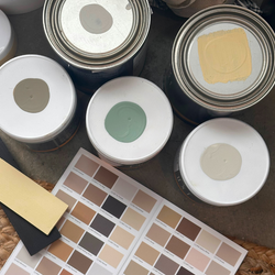
Keep it simple to start. Pick between 3-5 colors for a room palette. Choose hues that connect and have the same level of energy and ‘speak’ to each other and learn to trust your aesthetic intuition. (learn more here about how to choose colors click here)
2. Pair
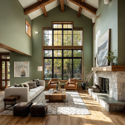
Once you’ve chosen your main (dominant) color, then focus on the complementary accent colors. Typically these lean lighter, darker or provide a high contrast. Be sure to consider your surfaces and lighting. Remember, when using bold colors, painting a ceiling, fireplace or door transforms them into an instant focal point without the color being overwhelming.
3. Layer:
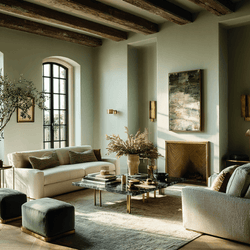
Now that the paint application has created the room's feeling and character, you can introduce fragments of color in other, very personal ways. This is a crucial point where you pull in your favorite art, rugs, and soft furnishings which you will add as a first layer. Then, layer in again your individuated personality. Pairing different textures and fabrics add depth and a luxurious lived-in feel.
"Working with colour, to partner and coordinate paint and fabrics, furniture, and the gambit of materials is a form of art in itself. For the most part, we are collectors of things rather than coordinators - so the skill of assembly is often where we get most caught up." - Philippa
4. Enjoy:
We want our homes to be more than just livable; we want them to be a place we want to retreat. A home brimming with individual style is a safe space that recharges our spirits and nurtures our souls. It captures the essence of who we are through the visual display and use of color intermixed with our cherished belongings.
The Power of Purple

One of our bolder yet versatile purples is Portuguese Dawn (C2-780), a warm medium-tone hue that falls between red and blue and is reminiscent of the Mallow flower. Romantically dusky, its slightly muted saturation can easily be lifted when paired with brighter more vibrant hues. There lies a lovely beguiling softness with this color that, despite its intensity, allows you to pair easily from either side of the color spectrum.
PAIRINGS
Whites & Lights

A light purple like Bella Donna can be used like a neutral
Also Try:
Coordinating Colors

Layering tones and integrating natural elements creates a chic, rustic feel
Related Neutrals

Unexpected Accents

One of our favorite color combinations is deep blue with a midtone purple
Deep Tone Palette

Purple and a deep red like Merlot create a modern mood.
As you show up in your creative practice, I want you to acknowledge your bravery – at taking risks, trying new things, making your mark, and moving confidently through the color process. If we’ve learned anything about the challenges of the past few years is that life is what you make it – so make it as colorful as you!


