Whether you're a modern minimalist looking to highlight crisp, clean lines or an adventurer that covets color and pattern, a nuanced neutral will highlight your style. By definition, Paperclip is a means of holding things together. As we enter 2021 with greater awareness, resilience, and redefined values, our connection with home is more profound than ever. It certainly deserves paint colors that can help you express all sides of yourself.


Winner: Best Supporting Role
If it were a Hollywood movie, Paperclip would most definitely win an Oscar for Best Supporting Role.
Effortless and easy, it falls somewhere between soft, warm oyster grey and light, tawny taupe. The versatility of its tone adds a veil of color that brings a depth that is almost “sans hue”, holding a quiet magic that whispers its presence without imposing.
Paperclip delivers on the promise of being a “pure neutral” -- one that provides a dynamic canvas for virtually any design style.
5 DESIGNER-APPROVED STYLING TIPS FOR PAPERCLIP (OR ANY "GREIGE" PAINT COLOR)
A true chameleon, Paper Clip is one of the most adaptable colors in the C2 Paint palette. The red and yellow undertones give it an embracing element that adds a warm, calming energy to the room. Though it’s lighter in color, it’s deep enough to contrast beautifully with white or dark trim.
1. Use in an open space plan or, as the trend (prompted by Covid) predicts, as a transition color for isolated spaces with individual functionality.
2. Paint as a gallery wall to highlight artwork.
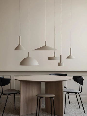
3. Achieve a minimalist/Scandinavian look with soft pale greens or muted yellows and pinks for a Northern Lights-inspired color palette.

4. Try tone-on-tone for a minimal, modern aesthetic.
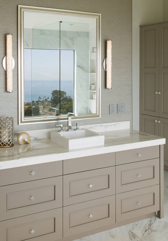
5. Use on kitchen or bathroom cabinets as an alternative to white. Amp up the style by pairing with Carrera countertops and a metallic tile.