Designer Detail: Zoe Feldman
We spoke with interior designer and rising star, Zoe Feldman, owner of a boutique firm in Washington, DC about her recent office build out and her thoughtful approach to color and design.

What was the vision for your new office space?
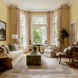
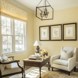
We moved into a historic townhouse so we wanted to retain the classic bones on the building but modernize it through paint colors and decor. We used C2 Milk Moustache to help open up the space.

Feldman used C2-692 Milk Moustache on walls and C2-851 En Pointe for trim
You chose such beautiful colors! Did you have a specific palette in mind or did you plan the paint color by room?
We wanted to keep the space cohesive and we're a female owned business so we used a more delicate, feminine palate. Even in the larger spaces we warmed the trim and kept the walls lighter to make the work spaces look airy, while keeping too much color from distracting from our scheming and design projects!

Many people are afraid to experiment with color and pattern. You have a way of combining and layering them in a way that seems effortless. What advice would you give someone who wants to experiment with it?
Start with a palette, choose up to only 5 colors, and use them in different combinations to mix and match.

What is your process when helping clients choose paint colors? Do you use color as a starting point for your designs?
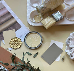
We start by assessing what colors our clients are naturally interested in and then we figure out what our palate is. After that we figure out how we are going to use the palette in public spaces where the colors are visible, and in private spaces that can go outside the color palette because they are behind doors or more hidden. Then we narrow it down to usually three paint colors per color, swatching on the wall for 2-3 days to see the colors in different conditions before going in to fully paint.

C2-529 Ambrosia on walls and C2-522 Red Stiletto for trim
Why do you like using C2 Paint?
The density of color! The colors are very saturated, so they add a lot of depth and interest to a room. They also tend to have a complexity to them, which allows them to be more versatile - for instance a grey may have both warm and cool elements and be able to work with more color palettes.
If you had to choose a C2 color that represents YOU, what would it be?
Ambrosia C2-529. It has an old world hand to it that reads as a neutral while still having a color profile but provides more interest than a putty or a white.
For more information on Zoe Feldman visit her website. Or, follow her colorful instagram account!


