The 2020 Color Palette
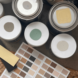
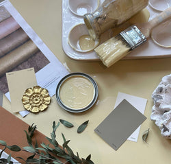
Our 2020 color palette showcases a modern and positive view of the future. The curated arrangement represents the innate intelligence of nature. Each carefully considered color can stand powerfully on its own or be paired to create a seamless, harmonious palette for the entire home. The softness of these colors honors the spirit of wellness and the importance of creating a nurturing yet reenergizing environment. The natural beauty of the collection creates a sense of flow and continuity that leads the eye in a graceful, intuitive manner.

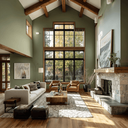
Salty Brine (C2-701)
This rich hue floats effortlessly between green and blue, giving it a richness and depth that can only be found in nature. Like water, it is fluid and diverse, carrying with it organic notes that honor the natural world. Its complex undertones emit a harmonic frequency to aid in our journey for deeper meaning and purpose beyond material possessions.

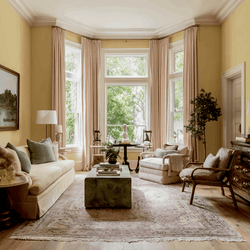
Lemongrass (C2-656)
A unique blend of neon and pastel, Lemongrass carries an on-trend freshness reminiscent of a palette-cleansing sorbet. The color’s undertones present a modern/techno vibe in a light, multi-functional hue that highlights the impact of intense, bright colors. Paired with crisp white, it leans modern, while a pale grey creates a subdued feel. Add a warmer neon or vibrant blue -- or simply adding it as an accent -- to offer a contemporary, energetic burst of color.

Cappuccino Froth (C2-784)
Cappuccino Froth emits soothing, “zen-ergy” with warm undertones that reminds us to relax and enjoy the simple everyday moments, while also rebooting our spirit through the nurturing comforts of home. This softer hue leans toward the more delicate side of the color wheel with deceivingly full-bodied colorants that take on an almost ethereal nature when partnered with other like-minded neutrals. Pairing with similar soft colors creates a quiet beauty, while earthy tones and rich umbers present a stronger contrast.

Tailored (C2-958)
Like a classic suit, Tailored was created to stand the test of time. The duality of its tone makes it modern and flexible and officially raises the bar for more complex color equations. As a bespoke mid-tone grey, it can perform multiple duties...working well with warm woods and earthy tones, or with the full scale of the grey spectrum. From the palest of grey whites to saturated smoky graphite into absolute black, Tailored provides a balance between modern and contemporary with the spirit of history.

Titan (C2-725)
True to its name, Titan is a compelling, inky blue that demands drama – and your full attention. Its saturated hue harkens the mysteries of the deep sea with a near-black nature that provides a sophisticated option for those considering a deep and moody tone. Titan is a nudge toward black but still holds the presence of being a color. It’s embracing strength creates striking visuals and makes it a perfect backdrop for art lovers or pair with a soft white for sharp contrast and color tension.

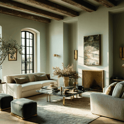
Lumen (C2-948)
Sometimes a space calls for beauty in its purest form. A full spectrum color is luminous like no other because using no black reflects the light instead of absorbing it. Lumen holds a reflective moon-like quality, like seeing a flickering, glowing light behind frosted glass. Mellow and calm, this luminous color works exceptionally well in areas with vast expanses of wall to enhance architectural vision and lines or a more minimal and simplistic feel.
FIND A RETAILER
SHOP THE COLLECTION


